
In the foot of Olympus, VOÍ Vins de roches practises permaculture farming in a rich, natural ambience of rocky landscapes. The Greek-French origin of the winemaker, defines the linguistic imprint of the label, as well as the naming. The name of the brand is derived by the Greek word “voi”, which stands for the undefined sound of the wind, running through the crops.
We were assigned with the brand’s identity system and the packaging design of the three wine labels. Our approach was defined by the meticulous study of the scenery’s qualities and how its properties are linked to the end-product.
The rocky sense of the area of the crops and the winery, as well as the transmission of the sound and the roar are the elements that inform the design direction of the logo. We applied a slanted typography, using Japanese calligraphy as the inspiration, which reflects the dynamism of the VOÍ wines.

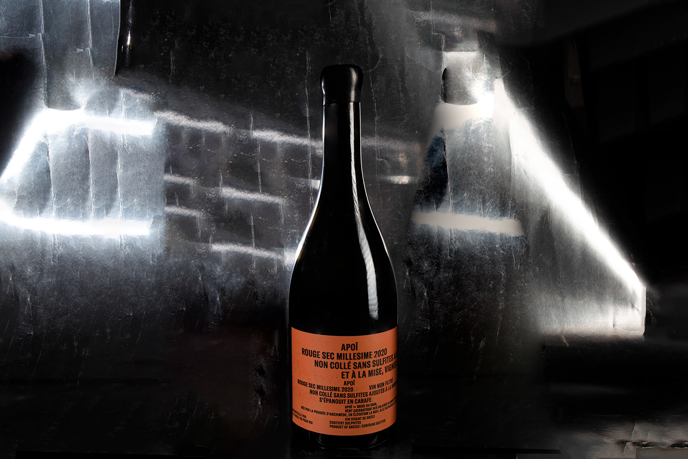
Apoi: A non-linear typesetting of the typography was adopted for the red wine label, following a repetitiveness that connotes the diffusion of the air, as the word “apoi” is Greek for the mountain’s morning breeze.


Hymnos: Paying homage to the unique product of white vinification from the Xinomavro variety in Greece, the letter ypsilon was placed centre stage, offering the option of a second reading, as the English letter h is the initial of the word “hymn”, the label name’s meaning.
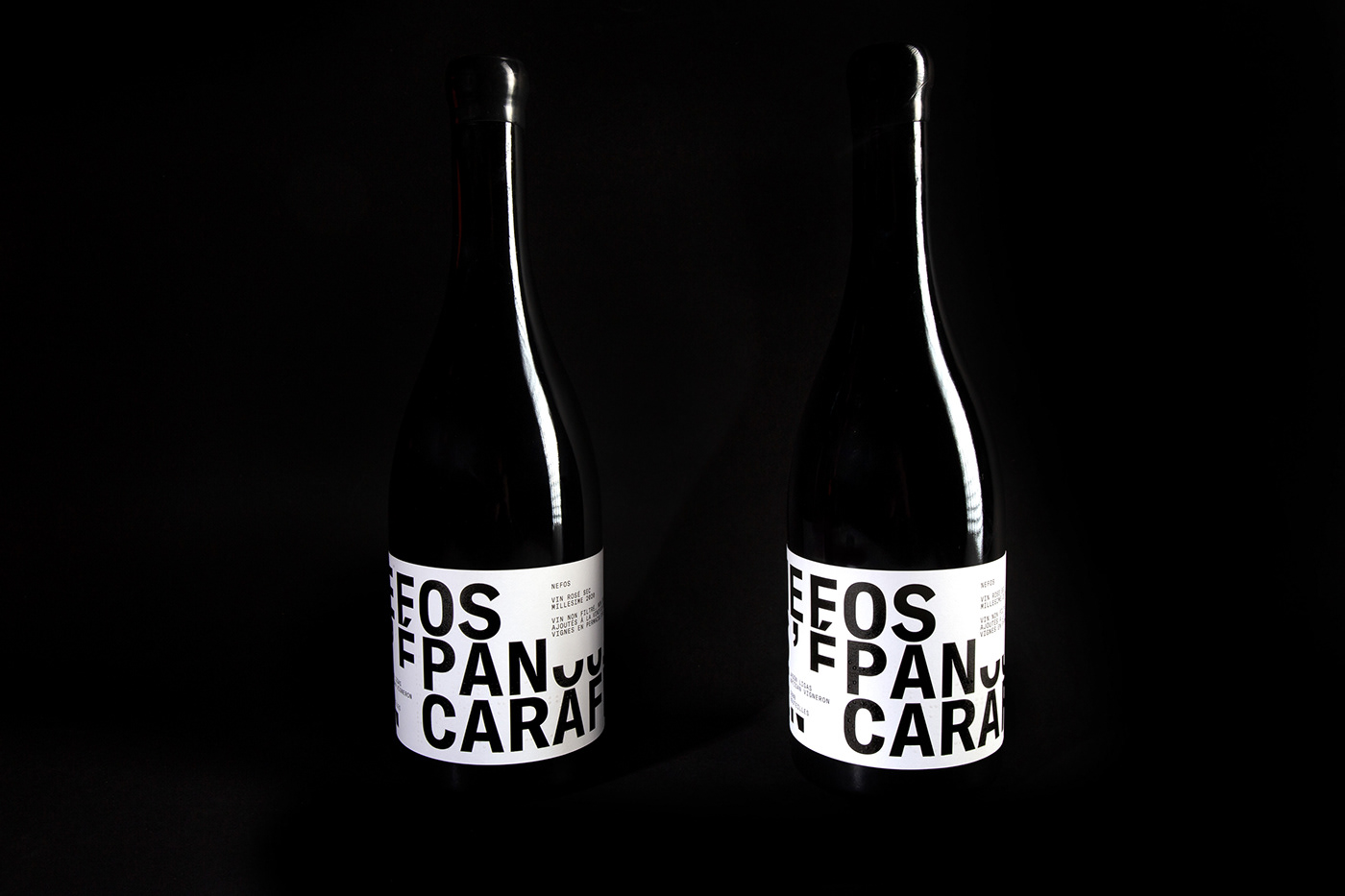

Nefos: For the rosé wine label, the design is governed by an interpolation of white frames interrupting parts of the large, coherent and imposing writing throughout the length of the label, as an imitation of clouds in the sky—the meaning for the Greek word “nefos”.

